Color
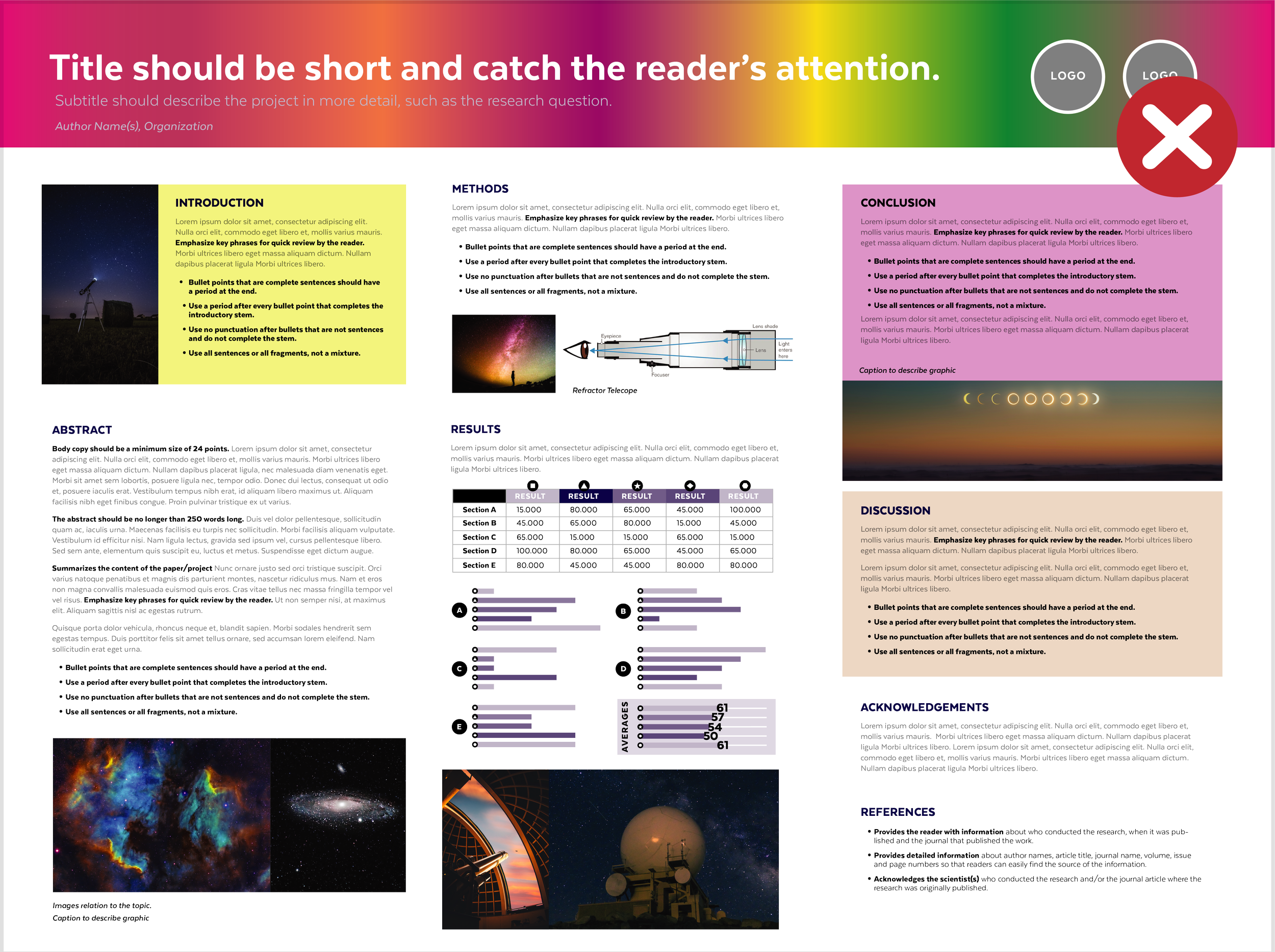
High-contrasting colors
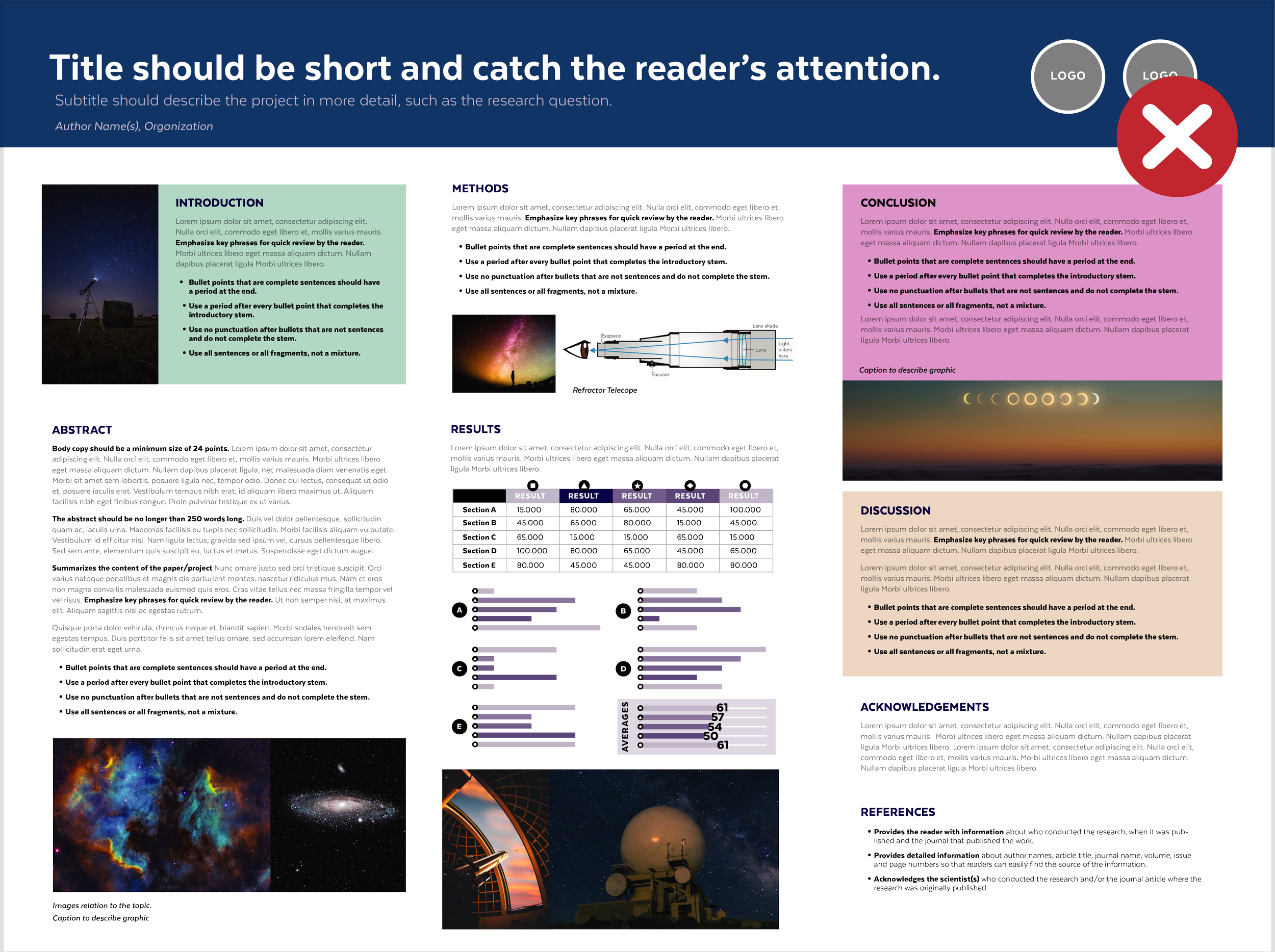
High-Contrasting colors are ones that look very different from each other and create an extreme visual separation.
Con: Too many contrasting colors in one design can create emphasis on too many elements, essentially making everything less emphasized.
Low-contrasting colors
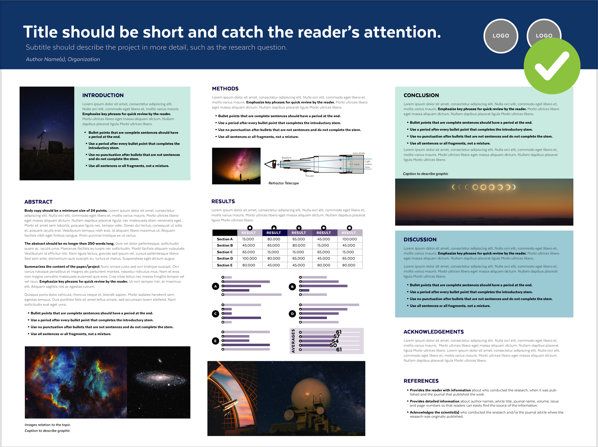
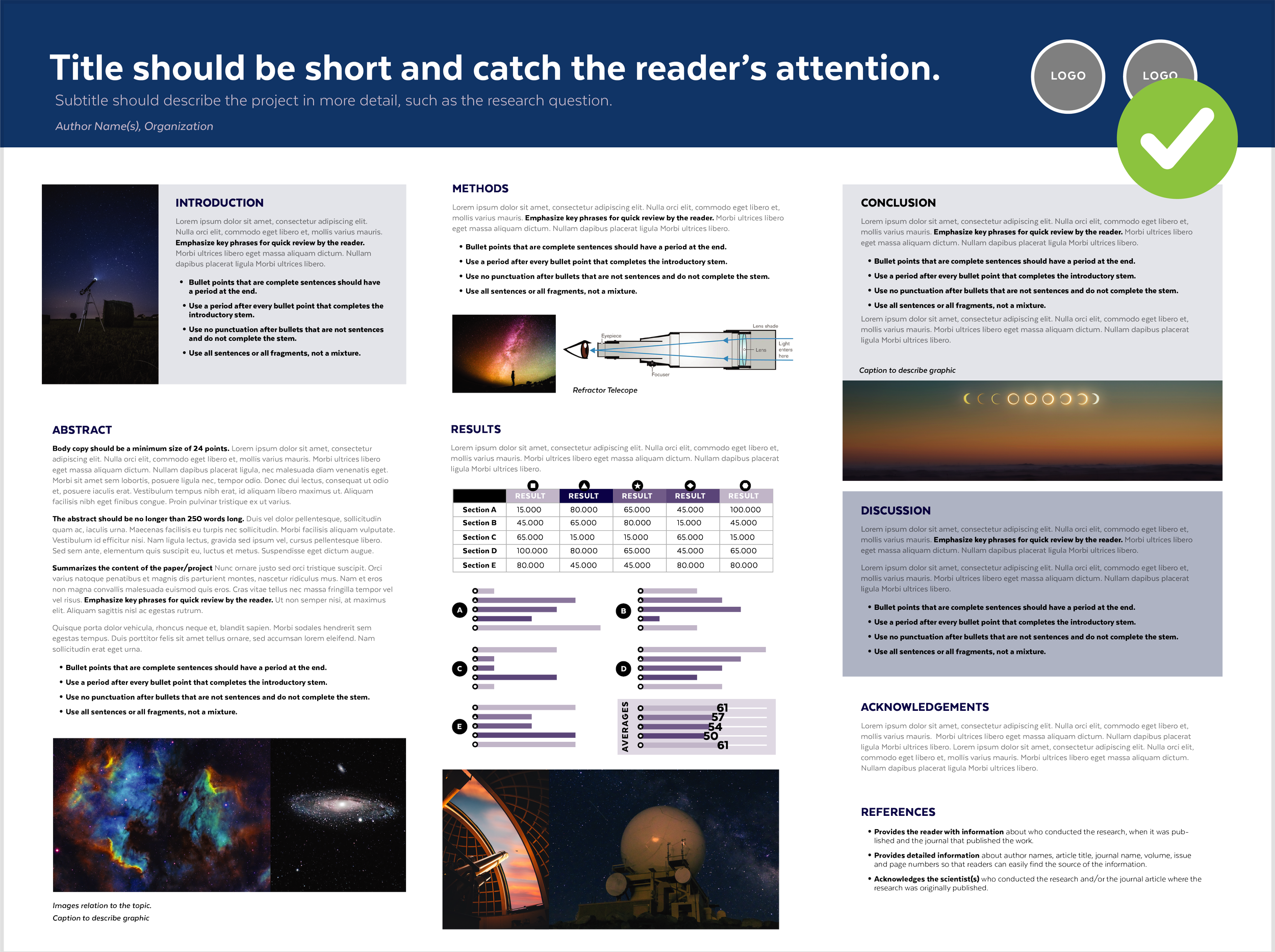
Low-contrasting Color Palette (Different shades of one color)
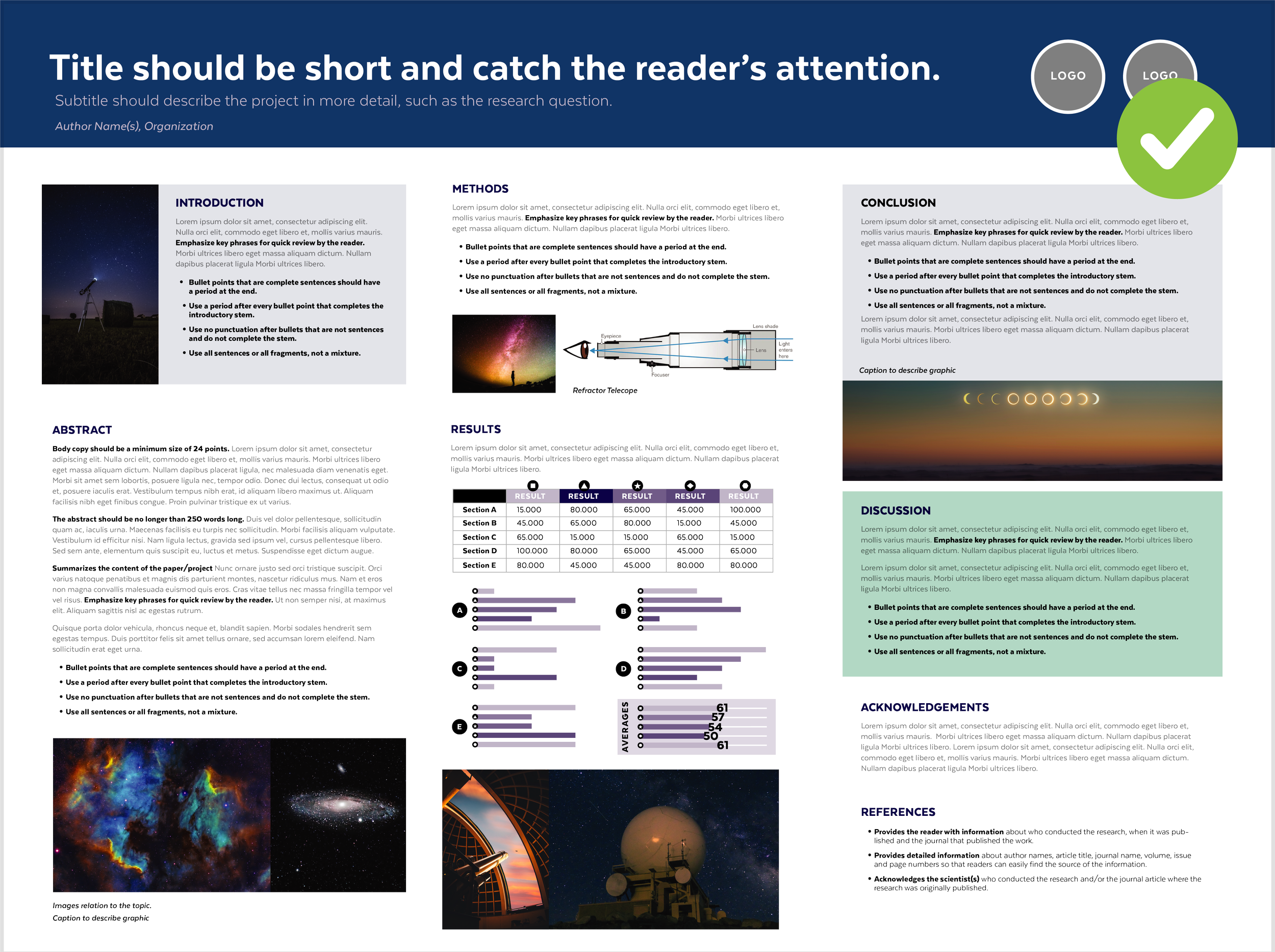
Low-contrasting Color Palette with a contrasting color used for emphasis
Low-contrasting colors are ones that are similar in color to each other and do not create an extreme visual separation.
Pro: Help unify a design.
Adding one contrasting color to a low-contrasting color palette will create emphasis wherever you use that color.
Con: Monochromatic color palettes can lack much visual interest if the designer doesn’t enhance the composition with added graphics or interesting layouts to engage the viewer’s attention.
Quick Tips
Color Tools
A quick way to unify (make your design match and look cohesive) is to choose a color based on a graphic that you are including in a design (such as a photograph).
Make sure that your colors all have the same saturation level, or they won’t look like they match with each other.
Rainbows can be used as a graphic (when appropriate), but you should avoid using rainbow colors in text and other elements. It is far too distracting and makes the text less legible.


